Pulumi Cloud Dashboard & Onboarding
Reimagining onboarding and the dashboard experience to better support users at every stage
Company:
Pulumi
Role:
Product Designer
Tools:
Figma
Overview
As Pulumi’s user base expanded, it became clear that the Pulumi Cloud Dashboard needed a redesign—one that could guide first-time users while still supporting experienced ones. I partnered with product owners, product managers, and Pulumi’s principal data engineer to create an integrated onboarding experience directly within the dashboard. A/B testing and internal feedback played a key role in shaping the solution. Rather than building a separate onboarding flow, we focused on embedding helpful, contextual guidance into the core product experience—making onboarding feel like a natural part of the platform.
Team
Jonelle Boyd, Product Designer
Pablo Seibelt, Principal Data Engineer
Eli Staykova, Product Manager
Meagan Cojocar, Product Owner
Craig Symonds, Product Owner
Goals
Provide meaningful, contextual guidance for new users
Minimize cognitive load and reduce onboarding friction
Maintain a clean, modular dashboard layout that can evolve
Design for flexibility to accommodate diverse user types and workflows
Challenge
The original dashboard didn’t offer clear direction for new users and lacked flexibility for different onboarding scenarios (e.g., team onboarding, individual projects, different cloud providers). There was also confusion between the Dashboard and Home pages, leading to redundant or missed information.
Key Challenges
Streamlining the initial user journey without overwhelming users
Creating one centralized place for onboarding, insights, and navigation
Designing a scalable system that could grow with the product
My Approach
To ensure the system was scalable, consistent, and easy to use, I followed a four-step approach grounded in UX best practices:
User & Stakeholder Collaboration
Partnered with product managers, owners, and the principal data engineer to map key user journeys and pain points.Competitive Research
Analyzed Terraform, AWS, and Vercel to benchmark onboarding strategies.Wireframes & Prototypes
Built low-fidelity wireframes and interactive prototypes. Tested internally and refined through feedback loops and A/B testing.UX Strategy: Progressive Disclosure
Gradually introduced onboarding content based on context and user behavior, reducing overwhelm.
User Journey
Through collaboration with the team in meetings and brainstorming sessions—as well as reviewing past user research, including defined personas and usability studies conducted by myself and other designers—I analyzed the current onboarding flow and identified areas for improvement. From this, I created a general User Onboarding Flow with the first three steps: Create New Account, Select Plan, and Pulumi Cloud—representing what users experience today. I also introduced a new fourth step: Getting Started, which features a dynamic module that suggests next steps based on the user’s subscription and activity. This module updates automatically according to the Pulumi products the user is actively using.

Research & Insights
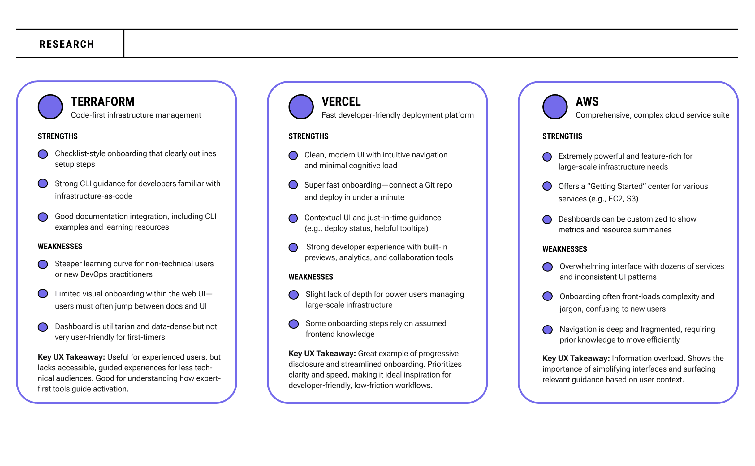
To inform the design direction, I conducted a competitive review of several cloud and infrastructure platforms, including Terraform, AWS, env0, and Vercel. I focused on how these tools onboard new users, present data, and structure their dashboards.
Key Insights
Terraform: Useful for experienced users, but lacks accessible, guided experiences for less technical audiences. Good for understanding how expert-first tools guide activation. and env0 offered clear, checklist-style guidance to help users get started
Vercel: Great example of progressive disclosure and streamlined onboarding. Prioritizes clarity and speed, making it ideal inspiration for developer-friendly, low-friction workflows.
AWS: Information overload. Shows the importance of simplifying interfaces and surfacing relevant guidance based on user context.

Prototyping
Using insights from research, I created low-fidelity wireframes to explore different login and onboarding strategies. I compared a single email-field login with a two-page flow separating Sign In and Create Account to evaluate which approach best supported ease of use and user clarity.
As the onboarding experience evolved, I explored several concepts for the Getting Started experience. I initially considered a dedicated home page for onboarding but ultimately chose to embed the module within a modular dashboard, creating a more seamless experience while providing users with simple, step-by-step guidance tailored to their progress.
To validate these concepts, I transformed the wireframes into a low-fidelity interactive prototype and shared it with engineers to gather early feedback on the overall flow, interactions, and navigation before moving into higher-fidelity designs.
View the interactive low-fidelity prototype:


Solution
Building on the insights gathered during research and prototyping, I redesigned the onboarding experience to reduce friction and help users get started with confidence. After exploring multiple login approaches through low-fidelity wireframes, including a single email-field entry and a two-page flow, we conducted A/B testing to evaluate user preferences. The results favored the two-page experience with a split-page layout that introduced Pulumi on the left while presenting the Sign Up form on the right. This approach provided a more focused experience, allowing users to learn about the platform while completing registration and guiding them through onboarding in a clear, organized way.
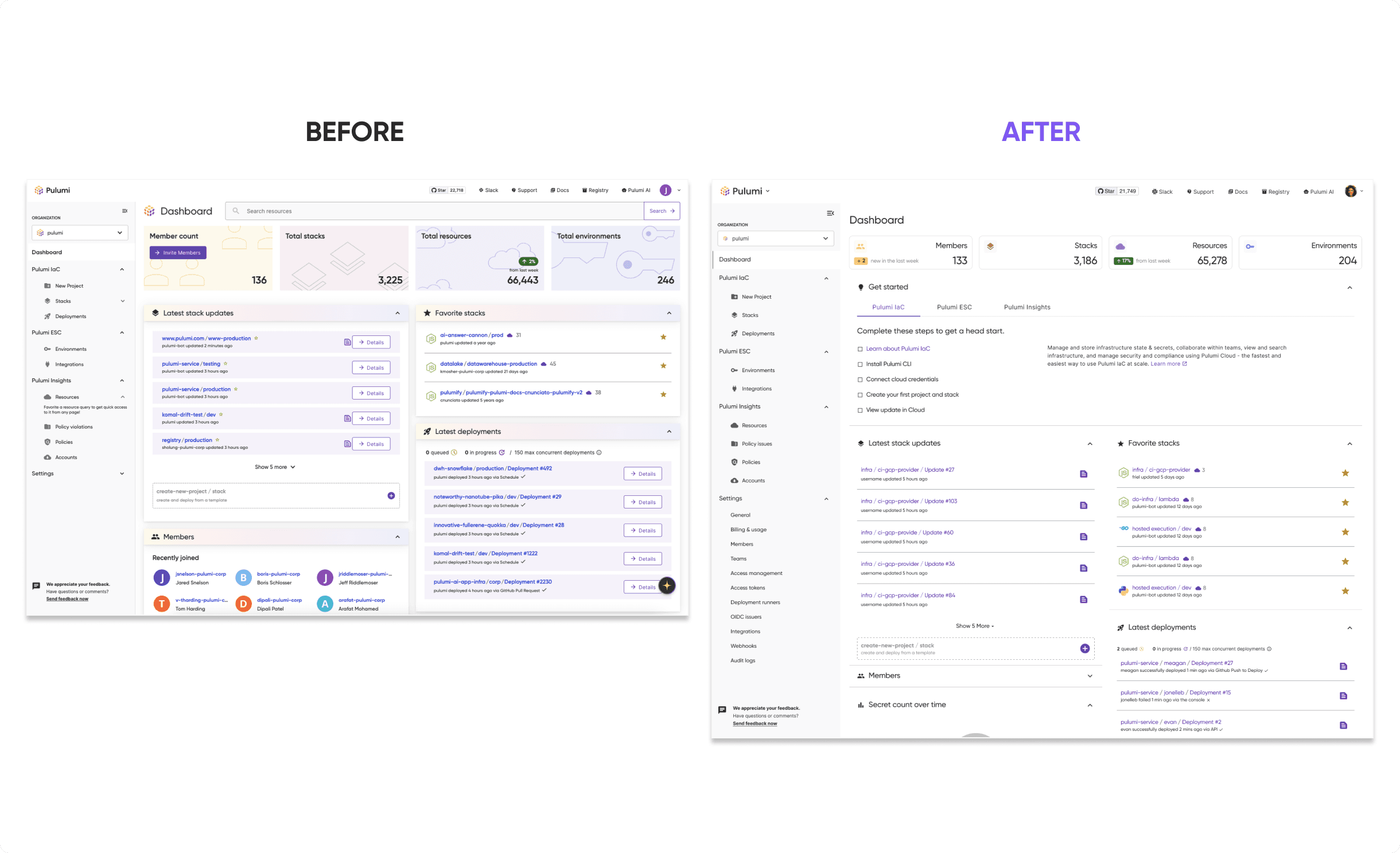
The redesigned experience extended beyond login into a modular dashboard with embedded onboarding. Rather than creating a separate onboarding destination, I integrated a Getting Started module directly into the dashboard, using action-driven cards, progressive disclosure, and contextual guidance to surface tasks only when they were relevant. This approach helped users build confidence step by step without overwhelming them, while creating a more seamless transition from account creation to product adoption.
To demonstrate the final experience, I created a high-fidelity interactive prototype that showcased the complete onboarding journey and dashboard interactions.
View the interactive high-fidelity prototype:

Impact/Outcome
The final redesign delivers an onboarding-friendly, scalable dashboard experience that seamlessly supports all users—from first-timers to power users.
Key Results & Metrics
Embedded, frictionless onboarding directly in the dashboard
A unified, modular layout supporting both onboarding and analytics
Enhanced clarity and navigation without sacrificing future flexibility
Improved usability and visual consistency across the platform
A 30% reduction in onboarding time (based on A/B testing)
Looking ahead, the plan is to introduce a customizable dashboard experience (view lo-fi wireframes), enabling users to add charts, remove sections, and personalize their workspace. Shifting towards a more analytics-focused dashboard, it makes sense to eventually move the onboarding content to a dedicated Home page—fulfilling the original vision while giving users greater control.